My Role
UX Project Manager
Problem
Serious Fun is a reputable and engaging after school program, but there are communication barriers causing parents to depend on staff as their main resource of information and not the website.
How might we make the Serious Fun website a reliable resource for users that provides clarity on program details and a seamless registration process?
Solution
Redesign website to be inviting, effective and easy to use and maintain. Smoothly integrate registration process from third party. Give users reasons to interact with website more often. Engage new users and enhance overall user satisfaction.
Users
Our survey and user interviews confirmed that our two main users were definitely women - single and married working mothers from varying cultural and ethnic backgrounds with too much to manage and too little time.
We knew we could address their greatest needs below in our redesign of the website.
Competitive Analysis
It was clear that Serious Fun could connect more with users if we introduced features that its competitors had like donation, volunteer and social media.
Design
After performing two rounds of Design Studio, first time with UX team and second time with our developers (which was really interesting), we wireframed our first prototype as shown below. By the third prototype, we progressed to high fidelity color.
More to Explore
After we redesigned the information architecture, users could explore and spend more time on the website. Before, the navigation was one level and wide.
Home is the Heart
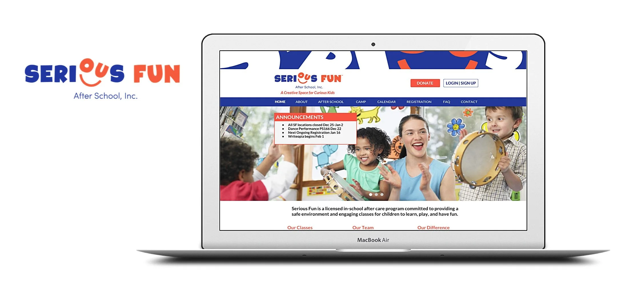
We knew the home page was crucial. Not only did it have to be informational, it had to be inspirational. We added a hero image of children enjoying to learn, a clear statement about Serious Fun's business, prominent buttons to login/sign up and donate and an announcement banner with up to date information so that users would return to the site for information.
Register to Play
Users' most important task on the Serious Fun website is class registration. It is a complicated process that takes users back and forth out of Serious Fun's website to third party websites with a lot of information and requirements. Our hope was that we could redesign the registration process and keep users in Serious Fun's website; however, the third party registrant was not able to work with our developers to make this possible. We focused instead on organizing the content in a user friendly layout with clear steps to help guide users through the process.
All About Location
Our research revealed that SF users are very spite specific. Users mainly communicated day to day with the site staff. Classes and events differed per site. So, we designed a site location page with an address and map, an announcement box, link to classes at that registration as well as photos and contact information for site staff. Basically, an all-in-one page that could provide both new and returning users with the information they need. This template also could be used for new SF sites in the future.
Usability Testing
Our biggest achievement was to reduce registration time by almost four minutes.We performed 2 rounds of usability tests and iterations to arrive at our final high fidelity prototype. Users informed us that they wanted more relevant information on classes and pricing, find information more easily and have an engaging and informative calendar.
Next Steps


